

Most mistakes happen because a fabric sample is judged up close, not across the room. For large coastal windows, I’d keep the rule simple: match the pattern to the room size, ceiling height, window width, and how much attention you want the window to get.
Here’s the short version:
- Large rooms and big window walls usually look better with larger motifs
- Tall windows often work better with patterns that support height
- Small repeats can fade in bright sunlight or look broken across large panels
- If your rug, sofa, or pillows already have prints, a quieter window pattern often works better
- If printed fabric feels like too much, texture can add depth without extra visual clutter
- In many coastal rooms, light can shift how a pattern looks by morning, noon, and evening, so I’d always check a sample in place before ordering
A fast way to decide:
- Measure the room and viewing distance
- Check how the pattern reads across the full window
- Compare it with nearby fabrics and surfaces
- Ask one final question: should the window stand out or fade back?
Quick Comparison
| Pattern scale | Best use | What I’d expect it to do |
|---|---|---|
| Large-scale | Big windows, open rooms, simple décor | Reads clearly from across the room |
| Medium-scale | In-between spaces | Gives some pattern without taking over |
| Small-scale | Quiet backdrops, rooms with many prints | Often reads more like texture |
One useful fact: in interior design, people often view large window treatments from 8 to 15 feet away, not from a few inches from the sample. That distance alone can change whether a pattern feels clear, soft, or too busy.
If I were choosing for a coastal space, I’d keep the goal plain: enough pattern to feel planned, but not so much that it fights the light or the view.
sbb-itb-bbd3158
Checklist 1: Match Pattern Size to Room Size and Ceiling Height
Start with the room’s dimensions. They set the pattern scale.
Measure the Room Before Choosing a Pattern
Measure the room’s length, width, ceiling height, and the viewing distance from the seating area to the window, or schedule a professional measurement. Then judge the sample from those spots, not just from a few inches away.
Test the sample in the actual room. Showroom light can distort scale and color [1]. Once you have that baseline, the ceiling-height check gets much easier.
Use Vertical Patterns to Support Taller Windows
On taller windows, choose a repeat that fits the opening’s proportions.
Decide Whether the Window Should Stand Out or Blend In
Decide early if the window treatment should act as a focal point or stay in the background. If you want the window wall to anchor the room, a larger-scale pattern can give it a more substantial finished look. If you want the view or another feature to stay center stage, a smaller-scale pattern or a neutral texture will help the treatment recede into the background [1].
Larger scale adds presence. Smaller scale steps back.
Checklist 2: Fit the Pattern to Window Width and Nearby Furniture
After you look at room scale, check how the pattern reads across the whole window and next to the furniture nearby.
Check Pattern Repeat Across Wide Windows and Panels
A motif that feels balanced on a small window can look choppy on a wide one. Small repeats often break up across large panels instead of reading as one clear look. On wide windows, go with a broader repeat so the fabric reads like a single surface, not a bunch of disconnected sections [1].
Balance the Window Pattern with Rugs, Sofas, and Accent Fabrics
Then look at the other patterned surfaces in the room. Your window treatment needs to work with the rug, sofa, and accent fabrics around it.
If the room already has strong patterns, scale down the window pattern so it supports the space instead of fighting for attention. The goal is simple: pick a pattern size that works with the prints already in the room, not against them.
When the room is layered with prints, it often helps to pull back to a smaller-scale pattern or a neutral finish. Light neutrals stay quiet and can shift with the room more easily if things change later [1].
Use Texture When Printed Patterns Feel Too Busy
If a print feels too busy, texture is often the better move. It adds visual interest without making the pattern scale bigger. Woven wood shades made from natural fibers like grasses, jute, or bamboo bring warmth without adding another printed motif. When the room already has plenty going on, a textured shade adds to the space without taking over. These woven wood shades for coastal homes also help bridge the gap between indoor and outdoor living areas.
That balance sets up the next choice: whether the room needs a bolder statement or a quieter finish.
Checklist 3: Choose Bold or Subtle Patterns Based on the Room’s Goal
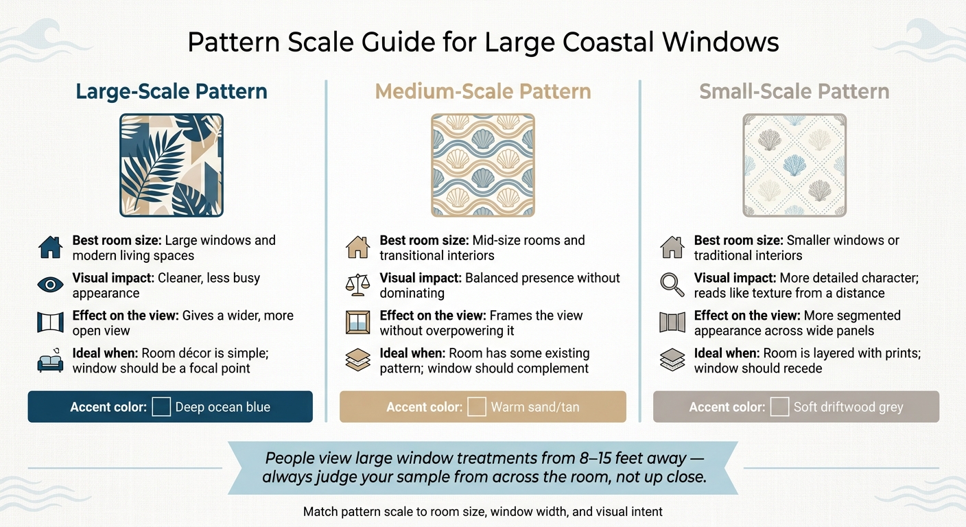
Pattern Scale Guide for Large Coastal Windows
Once you’ve matched the pattern repeat to your window width and balanced it with nearby furniture, the last choice comes down to intent. Pick the scale based on what you want the window to do in the room. Should it draw attention, or should it fade into the background? Use the room’s main visual priority to decide if the pattern should pull the eye in or stay quiet.
When Bold Patterns Work Best on Large Coastal Windows
Bold, large-scale patterns make sense when you want the treatment to read clearly and help the room feel open. On large coastal windows, bigger motifs can look clean and calm, especially when the rest of the space stays simple.
When Subtle Patterns or Simple Textures Are the Better Fit
If the view outside is the star, let the treatment step back. White or off-white finishes tend to blend into the wall color and keep things calm. Match the frame to the trim and molding so the treatment feels like part of the architecture.
Natural grain and other subtle textures can add warmth without adding visual weight. Solar shades and roller shades also help with glare and privacy while keeping the view open.
Comparison Table: Large-Scale, Medium-Scale, and Small-Scale Patterns
Use the chart below to match pattern scale to the room’s visual job.
| Feature | Large-Scale Pattern | Medium-Scale Pattern | Small-Scale Pattern |
|---|---|---|---|
| Best room size | Large windows and modern living spaces | Mid-size rooms and transitional interiors | Smaller windows or traditional interiors |
| Visual impact | Cleaner, less busy appearance | Balanced presence without dominating | More detailed character |
| Effect on the view | Gives a wider, more open view | Frames the view without overpowering it | More segmented or obstructed view |
Conclusion: A Simple Decision Path for Large Coastal Window Patterns
Start with the basics: room size, ceiling height, and window width. Then look at what sits nearby, like rugs, sofas, and accent fabrics. After that, do one last gut check: should the window stand out or fade back? In coastal rooms with bright light and big expanses of glass, that single choice often points you to the right pattern.
Key Points to Remember Before Ordering
Large rooms usually look better with larger motifs. Tall and wide windows also need a repeat that feels in step with the size of the opening. If the room already has a mix of patterns, it’s often smarter to go with a simple pattern or a textured fabric instead.
Always check a physical sample in the room before you order. Coastal light can shift a pattern’s scale and color from morning to evening, and that can change how the whole window treatment feels.
How Custom Measuring and Installation Can Help
With large coastal openings, fit matters just as much as pattern scale. AAA Blind & Shutter Factory offers free in-home consultations and professional measuring and installation to verify fit before ordering.
FAQs
How do I know if a pattern is too small for a large window?
A pattern can be too small when it makes a large window look busy or cluttered instead of balanced.
On big coastal windows, small-scale patterns often lose their shape or feel disconnected across wide glass panels. Larger patterns usually work better on tall or wide windows because they read more clearly from across the room.
It also helps to look at the space as a whole. The room size, ceiling height, and nearby furniture all affect how the pattern will feel once it’s in place.
Should window patterns match or contrast with my rug and sofa?
There’s no hard-and-fast rule here. For large coastal windows, pick a pattern that fits the rest of the room so the whole space feels pulled together.
A large, bold pattern can turn the windows into a focal point. On the flip side, small, busy prints can look a bit too hectic in a big space. A good rule of thumb is to match your window pattern to your sofa and rug in color and texture, so they work together instead of fighting for attention.
What if I want privacy without blocking the coastal view?
Solar shades are a smart way to get privacy without shutting out the view. In most cases, a 5% to 10% openness lets in natural light and keeps your outside view in place. If you want tighter glare control and a bit more privacy, go with 1% to 3%.
Plantation shutters are another solid pick. Their adjustable louvers let you block sightlines from outside while still leaving room to enjoy the scenery.
