

If your beach home gets strong sun, glare, and little privacy, Roman shades can help without closing off the view. I’d narrow it down this way: use stripes for a bold coastal look, soft blue washes for a calm feel, sandy linen for a quiet base, coral prints for more personality, woven textures for warmth, soft geometrics for a neat pattern, and solar/light-filtering shades when glare control matters most.
The main thing is to match the shade to the room, light, and view. In coastal homes, that often means fade-resistant fabric, UV-blocking liners, and hardware that holds up in salt air and humidity. The article also points out that some window coverings can cut solar heat gain by up to 77%, and blackout lining can block up to 99% of UV transmission.
Here’s the full lineup in simple terms:
- Bold nautical stripe: best for living rooms, sunrooms, and kitchens
- Soft blue ocean wash: best for bedrooms and relaxed living spaces
- Sandy neutral linen: best when you want texture more than color
- Coral and sea life print: best for guest rooms, powder rooms, and fun focal points
- Natural woven texture: best for warmth and a soft, casual look
- Soft coastal geometric or medallion: best for a neat, polished room
- Solar and light-filtering Roman shades: best for strong sun and glare control
Quick Comparison
| Pattern | Look | Best For | Light Control |
|---|---|---|---|
| Bold nautical stripe | Strong and classic | Living rooms, sunrooms, kitchens | Light-filtering to blackout |
| Soft blue ocean wash | Soft and calm | Bedrooms, sunrooms, living rooms | Light-filtering to room-darkening with liner |
| Sandy neutral linen | Quiet and textural | Open living areas, offices, dining rooms | Unlined, light-filtering, or blackout |
| Coral and sea life print | Beach-inspired and more noticeable | Guest rooms, powder rooms, breakfast nooks | Light-filtering to blackout |
| Natural woven texture | Warm and casual | Sunrooms, bedrooms, living rooms | Soft filtered light, more privacy with liner |
| Soft geometric/medallion | Clean and polished | Offices, sitting rooms, dining rooms | Light-filtering to room-darkening |
| Solar/light-filtering | Low-pattern and utility-first | Sun-facing rooms, media rooms, water-facing spaces | Moderate to high glare control |
If I were choosing, I’d start with sun exposure first, then privacy, then the pattern. That keeps the room comfortable and helps the shade look right once it’s installed.
Top 10 Coastal Window Treatment Ideas
sbb-itb-bbd3158
What Makes a Roman Shade Pattern Work in a Coastal Home
Glare is the first problem to solve. In beach homes, that matters a lot. The right beach house window treatments can cut solar heat gain by up to 77%, which helps when the air conditioning runs hard from May through September.[4] Once you handle glare, color becomes the next thing to get right.
Match shades to the landscape outside: taupe and oatmeal for dunes, blue-gray for water views, and sage or driftwood for marsh and live-oak settings. These tones tend to feel calm and easy in coastal spaces. Skip bright tropical prints and heavy dark patterns. They can look busy and make airy rooms feel smaller.
Pattern size matters too. Use small motifs or tone-on-tone textures on narrow bedroom windows. Save larger prints for wide living room and sunroom windows, and keep the same scale across paired windows so the room feels pulled together.
Fabric texture plays a big part here. Use a smooth or lightly slubbed linen when the room already includes shiplap, rattan, or jute. If the room has a lot of woven surfaces, a softer fabric helps keep things balanced instead of piling texture on texture.
In salt air and humidity, fade-resistant fabrics, UV-protective linings, and corrosion-resistant hardware extend the shade’s life. Get those basics right first, and the seven pattern styles below make a lot more sense for a coastal home.
1. Bold Nautical Stripe Roman Shades
A bold nautical stripe is often the strongest place to start. These shades use high-contrast horizontal or vertical stripes in sea-inspired color pairings – navy and white, cobalt and sand, or charcoal and ivory – to create a clear focal point. What makes them feel bold? Mostly the stripe width and the contrast between the colors.
Best Room Placement
These shades tend to work best in living rooms and sunrooms where you want a strong coastal look and the walls and furniture stay mostly neutral. They also fit nicely in kitchens and dining areas, especially with white cabinetry and light countertops. In bedrooms, narrower stripes in softer tones help the space stay calm instead of feeling too busy.
Stripe Scale
Stripe size matters more than people think. Wide, high-contrast stripes suit larger, simpler rooms. Narrow ticking stripes make more sense when the room already has pattern elsewhere. Horizontal stripes can make a narrow room feel wider, while vertical stripes draw the eye up and add a sense of height.
Light-Filtering Potential
Once the stripe scale fits the room, line the shade based on how much sun the space gets. Bold stripes come in fabrics that range from light-filtering to blackout, so the look doesn’t box you in. Use lined or blackout versions in sun-facing rooms and bedrooms. Blackout lining can block up to 99% of UV transmission and help protect furnishings from sun damage.[5]
Coastal Palette Compatibility
After light control, the last call is color balance. Navy and white is the classic pick if you want a more defined nautical look. Soft blue and sand feels more relaxed and less theme-heavy, which works well when you want a coastal mood without being too literal.
A simple approach usually works best:
- Pair stripes with white walls and two or three supporting tones.
- Limit the palette to two or three tones.
- Choose fade-resistant fabric and corrosion-resistant hardware.
2. Soft Blue Ocean Wash Roman Shades
Soft blue ocean wash Roman shades bring a gentler side of coastal style. Where bold stripes add punch, these shades smooth things out. Their watercolor blues – sky, teal, and seafoam – pick up the look of waves, sea glass, and that slightly misty line where the water meets the sky.
Best Room Placement
These shades fit best in living rooms, primary bedrooms, and sunrooms. In those spaces, they soften glare without shutting out the coastal view.
Pattern Intensity
Stick with light-to-medium washes. Lighter tones tend to work better in smaller rooms, while deeper tones usually look better in larger ones. A good rule: go one shade lighter than your first pick. A swatch can look just right in your hand, then end up looking darker once it’s up in a room filled with direct coastal sun.
Light-Filtering Potential
Light-filtering or semi-opaque fabric works well here because it softens daylight and helps the blue wash stay visible. Linen blends and cotton-linen weaves spread light more evenly, which keeps the look soft instead of harsh. A lining or backing can also help with energy use and protect furniture from UV exposure.
If this is going in a bedroom, privacy after dark matters a lot more. In that case, pair a light-filtering front fabric with a blackout lining. That setup can block about 85% to 95% of light while still giving you the coastal look during the day. [8][9]
Coastal Palette Compatibility
It helps to treat ocean wash shades as the main accent color in the room. Then build around them with warm whites, sand tones, and natural materials. They work especially well with:
- White trim
- Off-white walls
- Oatmeal or flax upholstery
- Rattan, driftwood, and woven baskets
Those natural textures balance the cool blue tones and keep the room from feeling chilly. Many coastal palette guides lean on a 60/30/10 formula: about 60% warm neutral, 30% white, and 10% muted blue-green accent. [1]
If you want even less color in the room, sandy neutral linen shades can keep the coastal feel warm and understated.
3. Sandy Neutral Linen Roman Shades
For rooms that need less color and more calm, sandy neutral linen Roman shades are the natural next step. Where ocean wash shades bring in color, sandy linen keeps the coastal palette grounded. These shades usually come in soft beige, taupe, warm ivory, and greige tones – colors that call to mind dry sand, bleached driftwood, and sun-washed fabric. The texture does most of the heavy lifting: a slight slub weave or natural linen finish adds interest without leaning on a bold pattern. [12][14]
Best Room Placement
Sandy neutral linen Roman shades fit nicely in living rooms, primary bedrooms, dining areas, and home offices. In open-concept coastal homes, they help tie together mixed finishes like white cabinetry, stone counters, and wood floors without fighting for attention with the view outside. That makes them a strong pick for rooms with several materials in play. They keep shared spaces calm and uncluttered. [6][11]
Pattern Presence
Pattern plays a very small role here. The draw comes from texture, not print. Solid sandy linens or fabrics with a faint slub weave make sense, especially when the room already has plenty going on – shiplap walls, a patterned rug, or rattan furniture, for example.
If the space starts to feel a little flat, bring in pattern through pillows or throws instead of the shade itself.
Light-Filtering Potential
Unlined shades soften daylight. Lined versions add privacy and help with sun control. For bedrooms or south- and west-facing windows that get strong afternoon sun, a light-filtering liner can block about 60–80% of light while keeping the neutral look in place. A blackout liner is a good fit for bedrooms or rental properties where privacy matters more, especially when buying from a local window treatment company that can customize the fit for maximum light blockage. [10]
AAA Blind & Shutter Factory can match liner weight to window exposure during a free in-home consultation.
Coastal Palette Compatibility
Use sandy linen as the base layer when the room already has strong views, texture, or color elsewhere. Sandy neutral linen shades work best as the room’s base neutral. They pair easily with soft blues, seafoam greens, and warm wood tones.
A smart move is to compare swatches beside your paint and flooring in morning, midday, and afternoon light. Coastal light can shift more than people expect. Choose a warm-toned fabric that still reads neutral when the sun is at its brightest. [13][2]
If you want more texture than color, natural woven shades take the look even further.
4. Coral and Sea Life Print Roman Shades
After softer linen and ocean-wash looks, coral prints bring the boldest coastal feel. Of the seven styles, these shades bring the most color and personality. You’ll usually see coral branches, starfish, shells, and other marine motifs repeated across the fabric. When the shade is lowered, it can read almost like framed art, tying the room to the shoreline without pushing too far into nautical décor. [7]
Best Room Placement
Coral prints work best in kitchens, breakfast nooks, sunrooms, and guest bedrooms where you want a strong coastal focal point. They’re a natural fit for sunrooms that overlook marshes or the Intracoastal Waterway, especially when paired with rattan or wicker furniture.
They also work well in guest bedrooms and bunk rooms in vacation rentals near Myrtle Beach and Brunswick County, where a beach-inspired look feels right at home.
Pattern Intensity
With coral and sea life prints, scale makes a big difference. Large coral branches and bolder marine scenes fit wide dining room or living room windows, where the full pattern repeat can be seen from across the room.
Smaller and more scattered motifs, like fine-line coral silhouettes or tiny shells on a light background, tend to work better on narrow windows, French doors, and bathroom windows. On those smaller openings, a large repeat can look awkward if parts of the pattern get cut off.
If the room already has a patterned rug or printed bedding, go with a softer, lower-contrast shade print. In most cases, one bold pattern per room is enough.
Light-Filtering Potential
Most coral and sea life fabrics use medium-weight cotton or linen blends that soften and diffuse light in a natural way. That can be especially useful along the Grand Strand, where afternoon sun can be intense, requiring energy-efficient window shades.
Backlighting tends to make the print stand out more. For bedrooms or south-facing windows, a blackout lining can help keep the room dark and protect the fabric from UV fading. With the right fabric and lining, shades can block 95% to 99% of UV radiation, which helps reduce fading. [15]
Coastal Palette Compatibility
Coral prints in blue-and-white, blue-and-sand, or blue-green color schemes pair easily with soft whites, warm beiges, and layered blues. For example, a kitchen with white shaker cabinets and brushed nickel hardware can pair nicely with a blue coral shade on a white background.
In a living room with driftwood flooring and tan upholstery, a coral print that pulls in taupe and muted aqua may fit better. A good rule here is simple: let the shade do most of the color work, then tie the walls and larger upholstery pieces to the print’s secondary tones.
If you want the same coastal feel with less print, the next style shifts toward texture.
5. Natural Woven-Texture Roman Shades
If coral prints feel like too much, natural woven-texture Roman shades move the focus from print to texture. The pattern comes from the weave itself, not from a printed design. That gives the room a softer look without making it feel busy or crowded.
Best Room Placement
These shades fit nicely in living rooms, sunrooms, and bedrooms where you want warmth and texture without a loud pattern.
Pattern Intensity
A lot comes down to the weave and the color. Tighter weaves in driftwood, gray-brown, or soft neutral shades tend to feel calm and understated. Chunkier, orange-toned bamboo, on the other hand, can clash with a coastal palette.[16][17]
Light-Filtering Potential
Woven shades help soften daylight, which can make a room feel more relaxed. Add a liner, and you get more UV protection and more privacy too.[18][19]
Coastal Palette Compatibility
Woven shades in sand, flax, driftwood, and warm taupe work naturally with the whites, soft blues, and warm beiges often seen in coastal interiors. Since the shade reads like a neutral, it can sit alongside patterned rugs, printed throw pillows, or textured upholstery without competing for attention.
6. Soft Coastal Geometric and Medallion Roman Shades
Coastal style can look polished without leaning on shells, anchors, or other obvious beach motifs. Soft geometric and medallion Roman shades bring in that coastal mood through repeating shapes and muted color, not literal seaside imagery. Think softened trellis, quatrefoil, or medallion patterns in pale seafoam, misty blue, sandy beige, or soft gray set against warm white or ivory. Washed edges help the pattern feel easygoing instead of sharp or overly graphic. This look sits nicely between texture-heavy neutrals and more literal coastal prints.[3]
Best Room Placement
Once you’ve picked the general look, scale makes all the difference. These shades fit especially well in primary bedrooms, sitting areas, home offices, and more formal living or dining rooms where you want a calm, polished space with a coastal feel. Smaller-scale geometrics tend to work best in bedrooms, offices, baths, and narrow windows. Larger repeats make more sense on wide living room and dining room windows.[3]
Pattern Intensity
The main things to watch are scale, contrast, and pattern density. Match the repeat to the size of the window so the design feels settled, not busy. Wide windows can carry larger medallions, while small rooms usually look better with tighter patterns and low contrast.[3]
Light-Filtering Potential
After the pattern scale is dialed in, fabric opacity shapes how the shade handles bright coastal light. Semi-opaque or light-filtering fabrics, including cotton blends, performance textiles, and linen-look materials, soften harsh glare without making the room feel boxed in. Adding a standard light-filtering liner behind the patterned face fabric improves privacy and helps cut fading while still letting the pattern show from inside the room. In bedrooms or media rooms, luxury blackout shades or room-darkening liners give you more privacy and less glare.[3]
Coastal Palette Compatibility
Soft geometrics and medallions read coastal when they stay in shoreline tones like soft blue, seafoam, gray, ivory, sand, and driftwood. Keeping the palette in that range helps connect cool and warm finishes in the same room. AAA Blind & Shutter Factory can help you choose the perfect coastal window treatments by selecting geometric patterns that complement existing décor so the shade ties into the room instead of fighting for attention.[3]
7. Solar and Light-Filtering Roman Shades for Coastal Homes
If you want the cleanest look possible, this style leans less on pattern and more on how the fabric works. Solar and light-filtering Roman shades help tame coastal glare while still letting in daylight and preserving the view.
Best Room Placement
These shades work well in sunrooms, water-facing living rooms and dining rooms, and bedrooms that get a lot of direct sun.
Keep the Surface Subtle
Go with fine weaves, tone-on-tone texture, or very soft stripes. Skip prints with strong contrast.
Light-Filtering Potential
With this style, function matters more than pattern. Solar fabrics work well because a 1% openness factor gives the most UV control, while 3% openness gives you a slightly clearer view. Both block most UV rays and help cut heat gain[20][21][22][23][24].
Light-filtering Roman shades soften daylight instead of shutting it out. In bedrooms, add a liner if you want more privacy.
Coastal Palette Compatibility
Stick with quiet shades like oatmeal, flax, soft white, driftwood gray, sea-glass blue, and muted green.
These low-key fabrics tee up the quick comparison that follows.
Coastal Roman Shade Patterns at a Glance
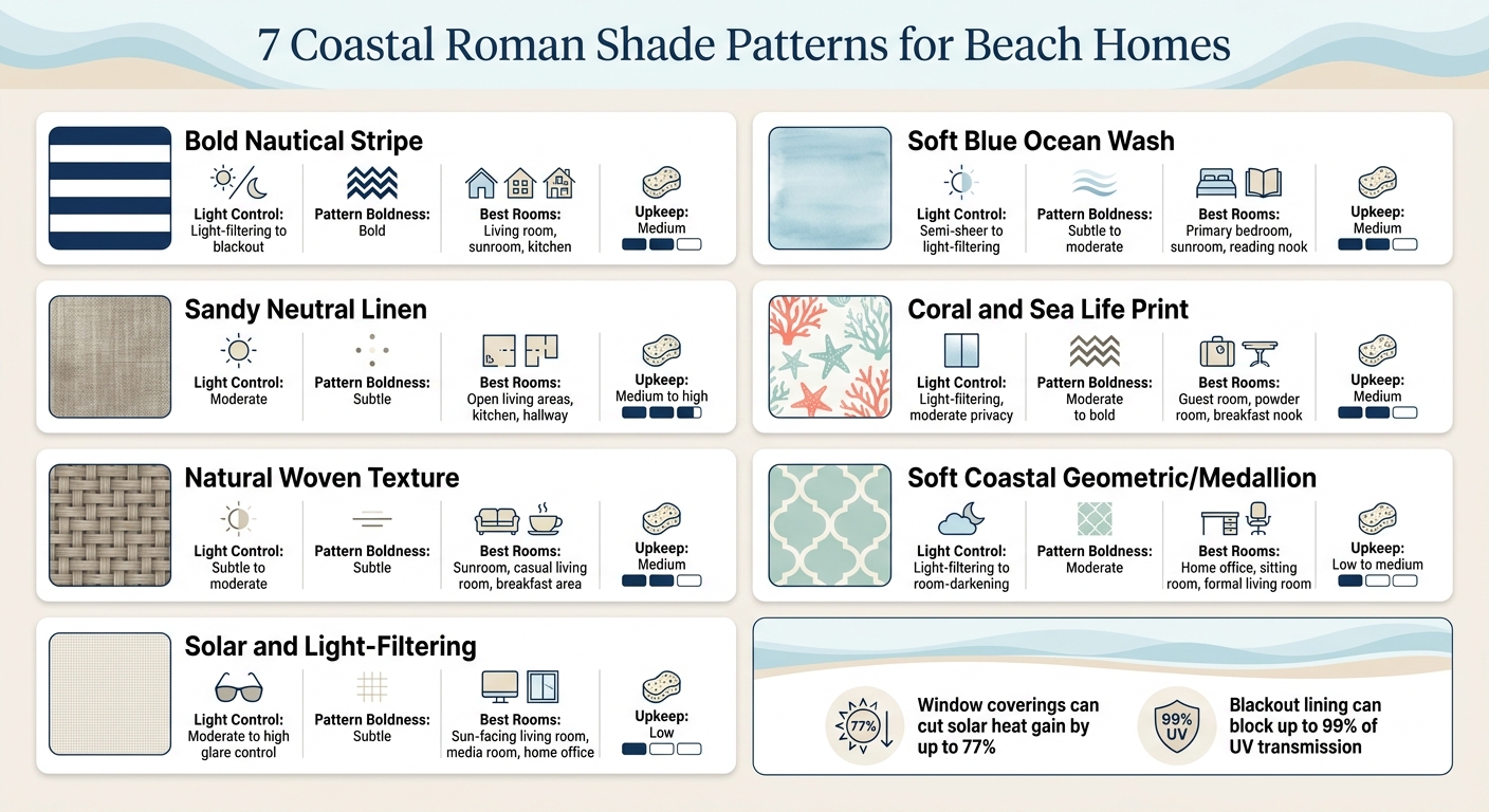
7 Coastal Roman Shade Patterns: Quick Comparison Guide
Use this quick comparison to narrow down the seven patterns by light control, boldness, and room fit. Start with glare and privacy. Then pick the pattern that feels right for the space.
| Pattern Style | Light Control | Pattern Boldness | Best Room Types | Upkeep |
|---|---|---|---|---|
| Bold Nautical Stripe | light-filtering, moderate glare reduction | Bold | Living room, dining room, home office | Medium |
| Soft Blue Ocean Wash | Semi-sheer to light-filtering | Subtle to moderate | Sunroom, primary bedroom, reading nook | Medium |
| Sandy Neutral Linen | Moderate | Subtle | Open living areas, kitchen, hallway | Medium to high |
| Coral and Sea Life Print | Light-filtering, moderate privacy | Moderate to bold | Guest room, kids’ bedroom, powder room | Medium |
| Natural Woven Texture | Subtle to moderate | Subtle | Sunroom, breakfast area, casual living room | Medium |
| Soft Coastal Geometric and Medallion | Light-filtering to room-darkening | Moderate | Home office, sitting room, formal living room | Low to medium |
| Solar and Light-Filtering | Moderate to high | Subtle | Home office, sun-facing living room, media room | Low |
Use the table to compare light control, boldness, and room fit before you choose a pattern.
Next, match the pattern to the room that needs the right mix of light, privacy, and style.
How to Match These Patterns to Different Rooms
Use the table as a starting point. Then match each shade to the room’s light, privacy, and view. Start with sun exposure and privacy needs first. After that, pick the pattern.
Living rooms and sunrooms are a natural fit for stripes and woven textures. Bold nautical stripes help ground large windows, while woven textures bring warmth without adding more pattern. Light-filtering fabric softens glare and still lets you enjoy the view. In bright sunrooms, add a solar shade behind a decorative Roman shade to help control glare during peak afternoon hours.
Bedrooms need softer color and more coverage. Primary bedrooms tend to work best with soft blue ocean wash or sandy neutral linen shades. Add a lining or a room-darkening layer for privacy and better sleep, especially in rooms with early morning sun.
Smaller rooms usually look best with one restrained focal pattern. Guest rooms, powder rooms, and hallway windows are good spots for coral prints and soft geometrics. Use coral prints in powder rooms and guest rooms when you want one strong visual moment. In hallways, a subtle medallion or small-scale geometric in navy, aqua, or sand can break up a long stretch of wall. Keep the surrounding décor simple so the shade stays the main focus.
AAA Blind & Shutter Factory can help plan layered treatments and confirm casing depth during a free in-home consultation. That matters most when layering treatments in coastal windows with limited depth.
Conclusion
The best coastal Roman shades do more than look beachy. They also help with glare, privacy, and heat. After that, the right pick comes down to how much pattern, texture, and light control each room needs.
Stripes, ocean washes, linens, prints, textures, geometrics, and solar fabrics all fit different rooms and light conditions. Some work best as bold focal points. Others are better for soft, filtered light.
If you want help narrowing down the choices for your home, AAA Blind & Shutter Factory can help. AAA Blind & Shutter Factory offers free in-home consultations, expert installation, and locally manufactured custom window treatments built for salt air and humidity.
Start by making note of which rooms get the most sun and which need the most privacy. Then match each space with the right pattern and lining.
FAQs
How do I choose the right Roman shade pattern for each room?
Match the Roman shade material and pattern to each room’s moisture, salt air, and sunlight exposure. Roman shades tend to use denser fabrics, which makes them a strong fit for living rooms and bedrooms, where privacy and a bit of sound control can make the space feel more comfortable.
In more humid areas, like kitchens or spots near bathrooms, be careful with natural materials. They can soak up moisture and often need more upkeep. AAA Blind & Shutter Factory offers free in-home consultations to help you pick the right fabric, pattern, and custom fit.
What lining works best for sun, glare, and privacy?
For the strongest control over sun, glare, and privacy, go with solar shades in the 1% to 3% openness range. That tighter weave blocks more UV rays, cuts harsh glare, and gives you more privacy during the day.
If you want even more control over light and privacy, luxury blackout liners or roller shades made with blackout fabric are also a great fit. AAA Blind & Shutter Factory can help you pick the right fabric and liner combo.
Which Roman shade fabrics hold up best in salt air?
In coastal homes, Roman shades deal with salt air and high humidity. Over time, that can lead to mildew and extra fabric wear. Heavier synthetic fabrics usually hold up better than many other fabric choices.
For more protection, add privacy or blackout liners and use corrosion-resistant hardware to help guard the shades and reduce rust. AAA Blind & Shutter Factory can help you pick the right fabric and liner for your space.
